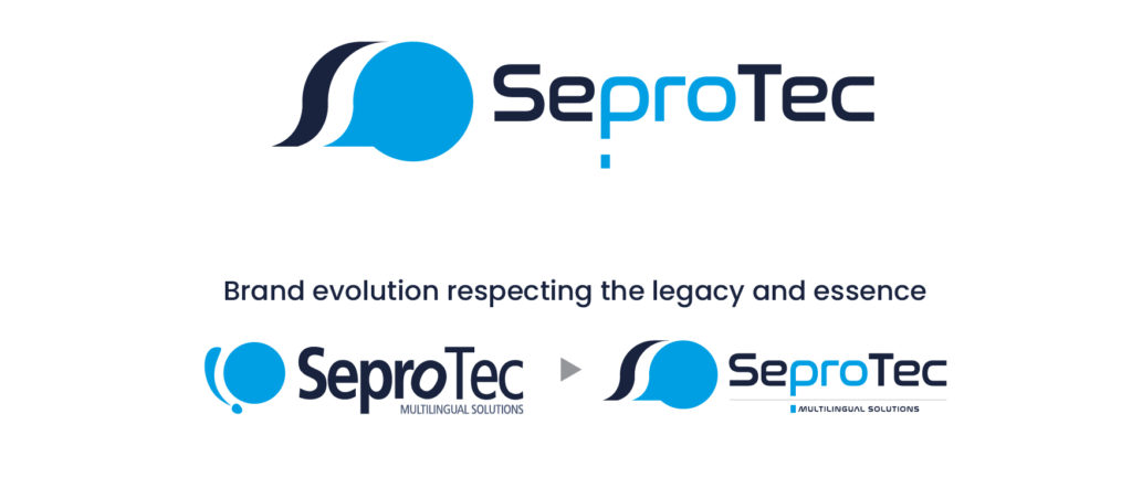
May 30, 2022 – Today we present a new corporate identity that reflects the new Seprotec Multilingual Solutions resulting from the strategic plan announced at the end of 2021. This road map is now strengthened by an image that captures the company’s leadership, potential and vision for the future.
The corporate identity is the calling card of any self-respecting company, as it represents its values and identity as a company. This rebranding, which begins with a change of logo, seeks to visually express the transformation and leadership of the company in recent times and which we believe will project a more modern, flexible and technological image of Seprotec, in line with the company’s new strategic proposition.
Respecting the essence and legacy, aligning the brand with the new strategic commitment
To create our new logo we wanted to maintain our distinctive colors. Blue remains as a unifying link, in a clear reference to the fundamental role we play as mediators of communication. On the other hand, the contrast of colors brings balance to our image, a tribute to the impartiality and rigor with which we practice our profession.
While respecting the legacy and essence of our brand, the new design transforms the company’s old isotype into the international symbol of communication. A symbol that paradoxically needs no translation since it is recognized throughout the entire planet. This is the link between translation, localization and interpreting, closely related disciplines that constitute our specialty.
Thus, the new corporate identity of Seprotec reflects this new corporate reality while inheriting the legacy of a company with a lengthy history in the market. It is a differential but recognizable logo, since it is an evolution of the previous logo.
Innovation and technology, reflected in a brand image
But what does this new logo mean for us? What values does it convey? It undoubtedly inspires reliability, leadership, innovation, flexibility and honesty, the corporate values of Seprotec Multilingual Solutions. However, what we value most is the bidirectionality it conveys, an example of the universality and public utility of the work we engage in.
Similarly, we have separated and modernized the letters that make up our name to symbolize the expansion of our role in the sector. A cleaner and more modern design to adapt it to the new times, so as to generate a brand expression that connects with today’s society, with the clients we work with and with the different audiences we target.
What does this change of logo mean?
As specialists in providing multilingual solutions, we feel an obligation not only to adapt to changes in the industry, but also to lead them. The pandemic has contributed to globalization and has accelerated a revolution that has waited for no one: innovation and the implementation of technology. To this end, we have added Nazca Capital to our shareholding structure and have drawn up an ambitious international growth plan based, in addition to organic growth, on acquisitions of companies specialized in multilingual services, as well as on the development of technology that provides new and better solutions for our clients.
We therefore continue along the path established several years ago: to provide the necessary tools and equipment to make language exchange possible, while at the same time embracing new developments, thus anticipating the demands of the sector.
In short, at Seprotec Multilingual Solutions we have launched a revamp that is already evident in our new logo. We will undoubtedly maintain our commitment to society to make intercultural communication feasible. We have learned from the past, excel in the present and will continue to improve and lead in the future.


